Interview with Juan Pablo Rodríguez Frade
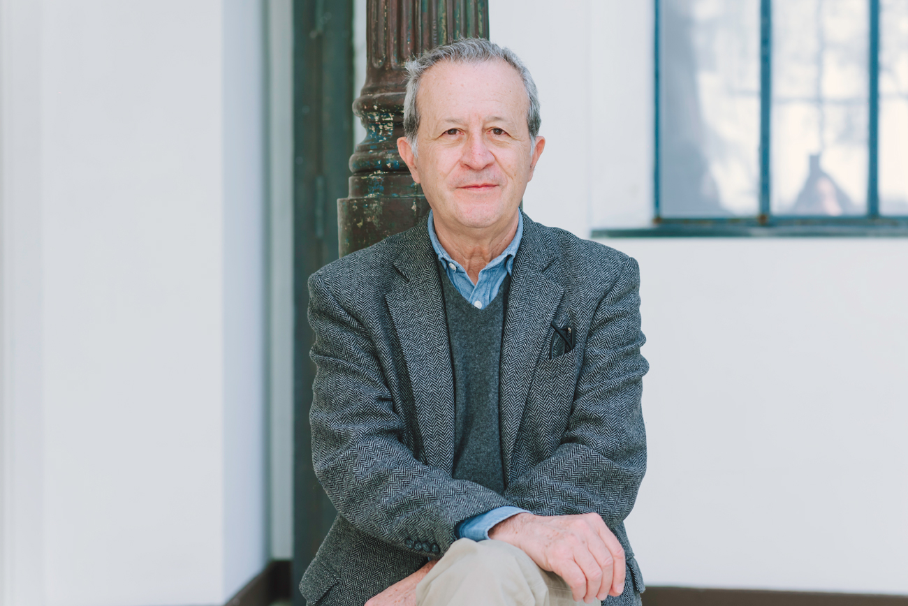
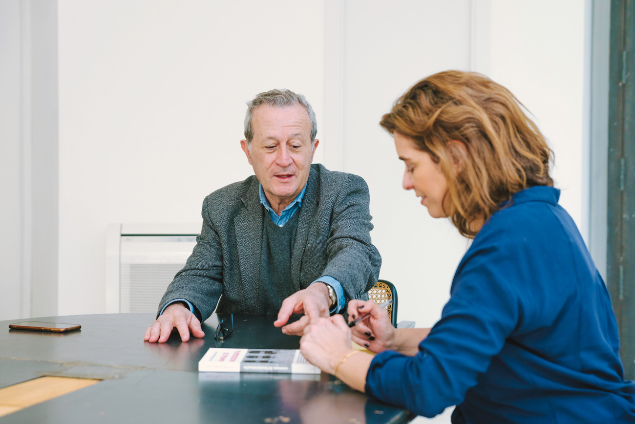
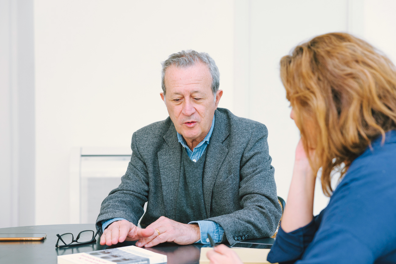
Juan Pablo Rodríguez Frade visits The Sibarist to tell us about the refurbishment project of the emblematic Arquería de Nuevos Ministerios which, as well as being the new headquarters of the Enaire Foundation in Madrid, will maintain its essence as a space dedicated to disseminating, promoting and researching architectural heritage.
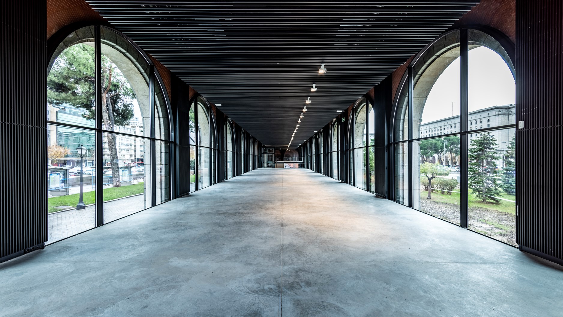
Designed in the 1930s by Secundino Zuazo and the engineer Eduardo Torroja on the site of the old Madrid racecourse, the 2,400 square metre La Arquería reopens after four years of renovation work aimed at preserving the original aesthetics of the building and making it more sustainable and energy efficient.
The space completes the cultural axis that runs from the Prado Museum and the Reina Sofía, through CaixaForum Madrid, the Thyssen-Bornemisza Museum, the National Library and the Mapfre and María Cristina Masaveu Peterson foundations.
The Arquería will be managed by the Enaire Foundation and will house both its permanent collection, with works by Genovés, Barceló, Tàpies, Canogar, Chillida, Lucio Muñoz and Martín Chirino, and temporary exhibitions. In addition, it will coordinate with the General Directorate of Architecture, Housing and Land of the Ministry of Development so that it maintains its essence and continues to encourage the dissemination, promotion and research of architectural heritage, as when it opened in 1983, with the exhibition Nordic Classicism, 1910-1930.
Frade Arquitectos is responsible for such important remodelling projects as the National Archaeological Museum (MAN), which won the Aga Khan Award (2010), but also for museographic works such as the design of the recently celebrated exhibition ‘Sybilla. El hilo invisible’ at the Canal de Isabel II hall.
What were the main difficulties in the rehabilitation?
The work began before the pandemic and, although it seemed simple, it has been very complicated because of the health situation, because of Filomena and because of the rise in prices.
It is a hall that is located in a very attractive place that extends the museum mile from the Reina Sofía to CaixaForum, Thyssen, the Mapfre Foundation and that traditionally was a hall for exhibiting architecture, where Renzo Piano and Foster, among others, have been exhibited, until it became a real place of pilgrimage for architects who came every Thursday, so it acted as a meeting point because there were barbaric exhibitions.
What are the qualities of this emblematic building that made it so internationally important?
The uniqueness of the building lies in the fact that it is not an exhibition hall. Before the Civil War, when Zuazo planned the immense work on the Nuevos Ministerios, he wanted to start with the arcades and, at that time, he was asked why if it was anecdotal and he answered that, precisely because if he left it until the end it would not be done, which was a very wise decision on his part, in other words, he gave it a lot of importance.
In the 1980s, Molezún and later De la Sota did work to convert the space into an exhibition hall, but it is a model of space which, by definition, is bad for exhibiting because it is all windows and glass, the light comes in from the east and from the west, which degrades a painting, a watercolour or a drawing, there is no surface for hanging, in short, it is very beautiful but complicated. But, curiously enough, with these conditions it worked very well as an exhibition hall. Then it happened that when partial works are made, it ends up being a Frankenstein.
What was the process like and what were the objectives?
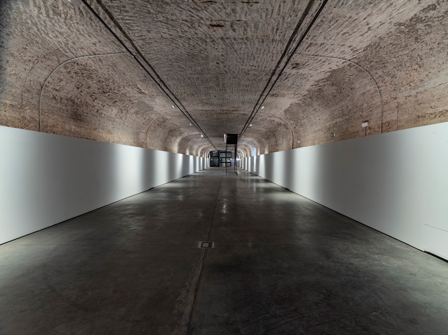
We won the competition to remodel La Arquería, which is an impressive space. The structure is by Torroja and on the ground floor there is a tunnel, quite unknown, but the suburban train and the metro are not far away, that is to say, you can’t dig it. On top of that, as it’s made of concrete, you can’t bring installations, air conditioning and you’re tied down. It is a conditioned space. We had to add accessibility, fire evacuation, air conditioning, ultraviolet and infrared light control, in short, it was necessary to make a great effort and, nevertheless, it is a typical example of doing a lot so that it is not noticed. For me, that is a value, that you enter the space and wonder what has been done.
How did you manage to make the upgrade go unnoticed?
Everything that has been done, with the collaboration of BOV estudio, I think that only the person who is paying attention will notice that issues such as temperature, humidity and lighting are better. This has been achieved with a great effort of humility, trying to ensure that if Zuazo were to see the building today he would say “it has been updated but it is still mine”.
We have not tried to leave a strident gesture of design from the beginning of the 21st century and print your mark, but rather something that does not go out of fashion in order to maintain it and that in 50 years’ time it will be just as valid as it is now, based on effort and with a good dose of being one step behind the work you want to rehabilitate.
Restoring 20th century architecture is like restoring a painting. As they are closer to the language, for example, Magritte will be easier to restore than a Caravaggio. In this case of La Arquería, the language and the material is practically the same and I fully identify with Zuazo’s architecture.
How would Secundino Zuazo have done it?
He would never have destined La Arquería for a museum. The building is a filter to enter the public garden, I think it was more of a lodge, and a place of passage or an anteroom to something.
What was the situation?
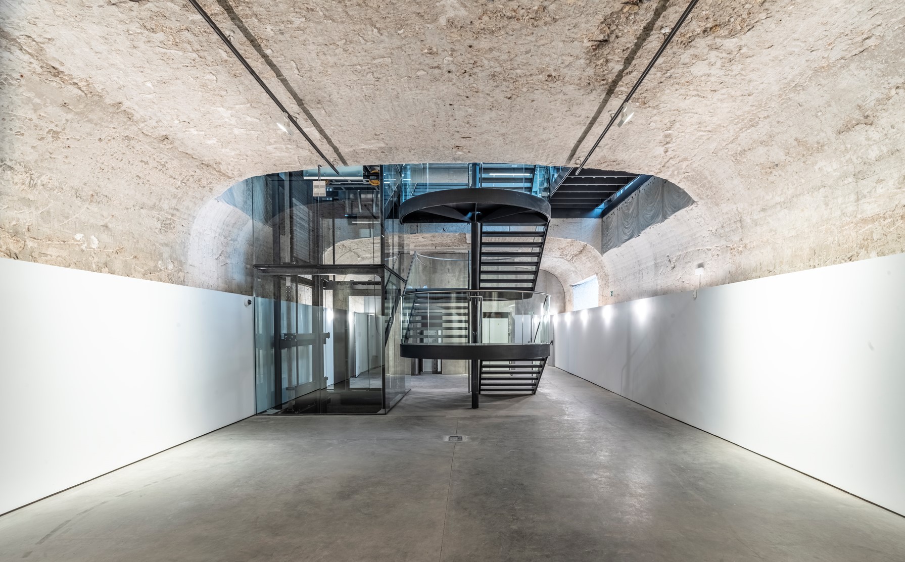
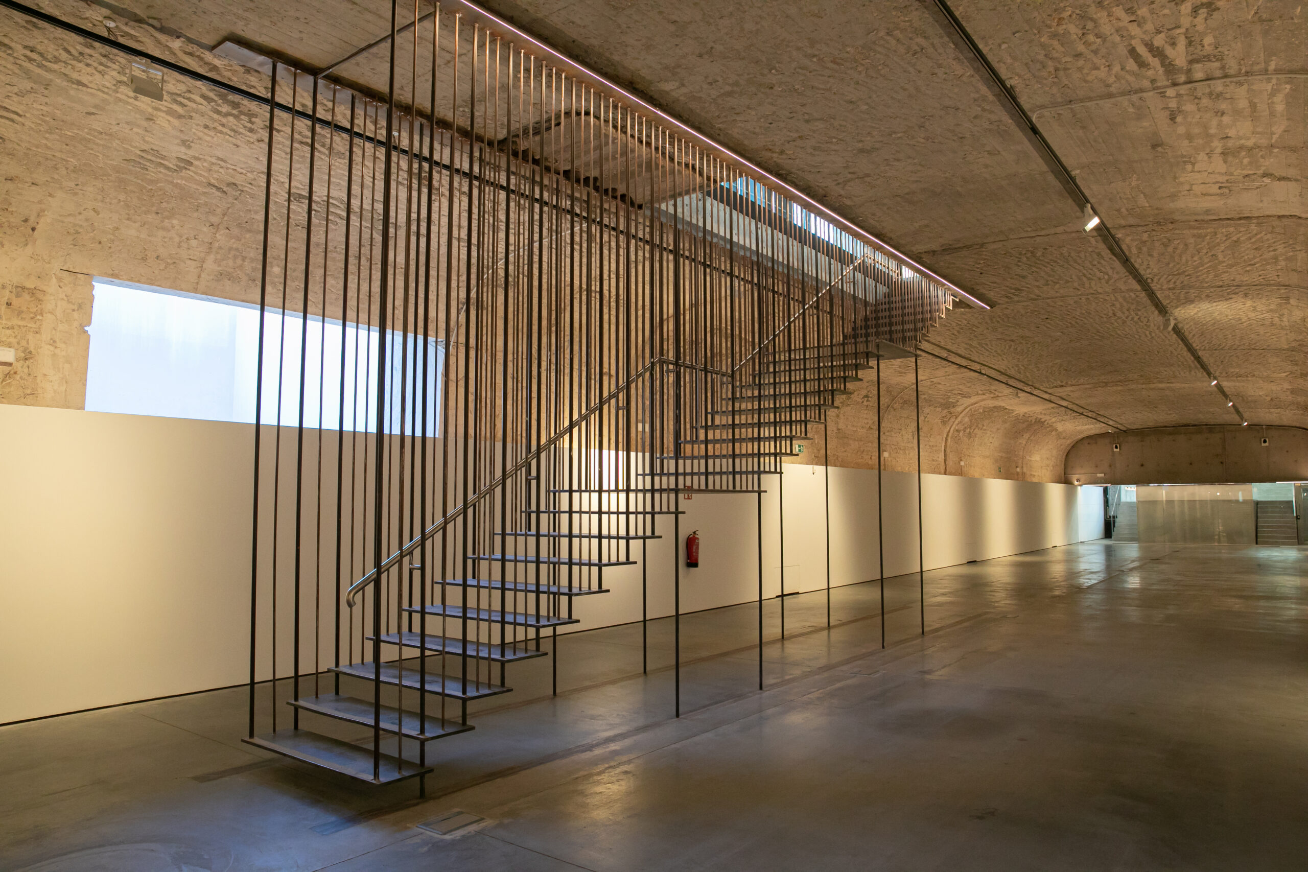
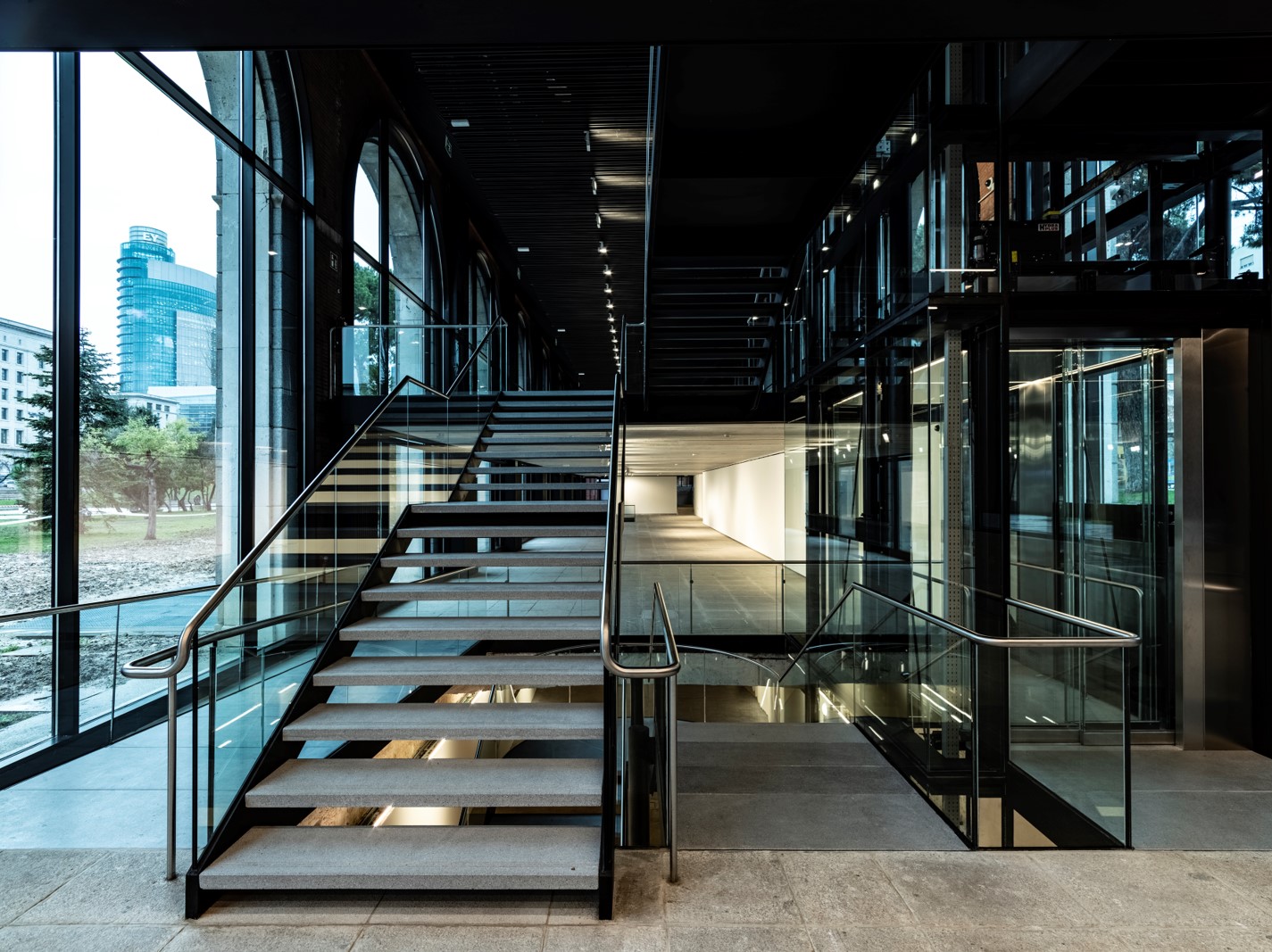
We found a mixture of stairs, storerooms, toilets that didn’t work, nor was it accessible from the Paseo de la Castellana, from where it was necessary to save several steps. Now we have achieved total accessibility for both people and works of art, because large packages can now be brought in by means of a freight elevator.
It has been adapted to be a museum space and complies with the standards of the Facility Report, a report on facilities and resources that all venues intended to exhibit works of art must have.
After refurbishment, it meets the necessary standards. For example, if a request is made for artwork to be exhibited, it will be granted, which was not the case before. With the work we have rationalised the uses, the circulations so that when you enter you realise that everything is up to date and complies with technical codes.
How have you solved problems with the lighting, for example, which made it unsuitable for exhibitions?
All the glass has been replaced and fitted with a concrete filter, as have the window frames and the communications core, which has been designed as a strategic nucleus. The toilets have been placed in a reasonable place and, very importantly, the hall is an elongated space that has a classroom in the north area that we have adapted so that it can be used independently of the exhibitions. Until now it had no independent access or toilets and you had to cross from the opposite side accompanied by a guard to get through a space with works of art, and there was no lift for wheelchair accessibility. Now, the lecture hall can be used in addition to the temporary exhibitions or independently for events, i.e. it has become more flexible.
Preserving the architecture over time in order to maintain the personality of the building, how has this been done, apart from with modesty?
Well, modesty is not because I am modest, but because it is a starting point to ensure that the heritage survives and the only way to achieve this is by updating it. That is to say, unless it is a ruin, what is necessary is to update the buildings so that they survive and that requires a certain sacrifice in details that did not exist originally, although that way you get it to survive in 30 years’ time. In architecture it is not enough to be nostalgic, if we want it to survive we have to update it the more gradually the better. In this sense, Paris is a model because it is always new and always old; it is the best way to be sustainable.
How did you manage to make a building from the 1930s sustainable or energy efficient?
The former has been possible by maintaining the use, not by throwing away and building. It seems to me that the best way to be sustainable is to maintain the pre-existing and renovate.
Of course, there are buildings that are easier from the point of view of energy efficiency than others and here, for example, the basement has been easy because it is like a cave with a good inertia and where the temperature hardly fluctuates between summer and winter. It is true that, as the walls are made of concrete, we have had to do a lot of work. On the upper floor, the supplies and air-conditioning systems are covered with a lattice and, on the lower floor, they are hidden behind the wall. It is true that the site is full of glass to the east and west and this requires greater expense, but it has its solar panels and corresponding energy seals.
It is a challenge to rehabilitate a building like this, have there been things that you have not been able to touch?
It is in a BIC protected area, which is the highest level, but licences have been requested and presented to the heritage commission of the Community of Madrid and the City Council, who are the ones who have to approve the project. It has been necessary to adjust some solar panels on the roof that have been installed horizontally which, although they are less efficient, meet the required aesthetic criteria.
It will be the future headquarters of the Enaire Foundation, has this influenced any specific decision?
The Enaire Foundation is the one who commissioned us and who set out the programme we had to fulfil, that is, two floors for permanent exhibitions and one for temporary exhibitions and, from there, we have worked very well, the relationship has been great because they have a lot of criteria.
How do you configure a museum for the user, taking into account, in addition to the container, everything that makes up the interior?
At the National Archaeological Museum we first won the architectural remodelling competition and then the museography competition, so we have been able to control everything from the most architectural elements, such as installations, structure and roof, to the audiovisual systems, display cases, models and even the door handles. That is to say, everything good and everything bad is our fault and that is very good because it becomes a focal approach to the project and in the end you have the capacity to design down to the last screw.
Sometimes we come across buildings that fail in the museography because of the absence of care in these details…
There are some very good buildings in which the museography is a complete mess because this discipline is really recent in Spain because it began in the 1980s and until then it was the director of the museum who assembled the work of art. However, from that decade onwards, it was thought that museography had to be at the service of a story so that the pieces were actors in it.
There is a quote that I like very much. Thelma Schoonmaker, editor of Martin Scorsese’s films, was asked how she felt working with such violent stories and she said that they weren’t violent until she edited them. Well with museography the same thing happens whether it’s temporary or permanent, the curator gives you a discourse, some pieces, something he wants to tell, and if you tell it in a dramatic or sentimental way, with contrasts or aseptically, it’s one museum or another.
What things do you see that are sometimes less taken into account when someone makes a museum, unnoticed details that mark whether a museum is well designed or not?
For me it’s the tone, the character, when you make a museography that you realise what is intangible. With architecture and museography, the pieces have to be comfortable in the building, and by this I mean in terms of scale, lighting, dialogue with the other pieces, bearing in mind that they were created for another space, such as a palace or a private house.
When we talk about neutral museography, it is a complicated thing to interpret. Museography has to help to enhance the work of art and that is not achieved by putting up a white background, but rather you have to create a background of perspective, that the lighting does not reflect, that there is a dialogue between the container and the content so that the building and the pieces come out winning and, what is most important, that it is at the service of the visitor and that they leave knowing more because the pieces have moved them. In a museum, if I am moved by a situation, I am more likely to want to investigate.
You have to reach knowledge through emotion and it seems to me that there are many museums that are like fireworks, with a lot of technology, a lot of interactive panels, a lot of buttons and a lot of immersive experiences, but that in the end they remain cold.
A museum has to serve to educate, excite, make you feel better and leave thinking that you’ve had a good time and that you’ve had a good time and that you’re left with something that generates questions.
In my book ‘Manual de Museografía’, I quote Antonio Bonet Correa who talks about the museum as a place where you feel at ease, surrounded by beautiful things, in silence, with a good temperature… In this sense, it seems to me that sometimes museums tell a lot, the graphics, the illustration, the interactive text are very important, but what I want is to be moved by something.
With the knowledge you have and as a user, tell us some museum projects with permanent exhibitions that have moved you and that you think are an example to follow.
My favourite is the Museo Castelvecchio, by Carlo Scarpa in Verona, which I think is a real showpiece. In Spain, the Museo de Arte Abstracto in Cuenca, where we have been in charge of the remodelling, extension and air-conditioning, which is an enormous effort for a building like the Casas Colgadas. Outside our country, I would also mention David Chipperfield’s Neues Museum in Berlin, which is a ‘piece of work’ both in terms of architecture and museography.
A dream to be fulfilled in your profession, something you would love to do if you were allowed to.
We are working on many competitions, some of them outside Spain, specifically in Morocco, and also in northern Europe. Right now, I would most like to rehabilitate a good, important building in Europe, another museum of the volume and quality of the MAN, and manage to do the architecture and museography.
Now we are working on the San Isidoro de León project and, soon, we will inaugurate the Lola Flores Museum in Jerez de la Frontera, in a small building called La Nave del Aceite, together with the same curator of the Sybilla exhibition, Laura Cerrato Mera, with Mariola Orellana and Rosario who put in the pieces, and which opens at the end of the month when La cantaora would have turned 100 years old.
What do you feel most satisfied with in La Arquería?
Winning the competition already gave us a rush and the greatest satisfaction is the use of resources, that is to say, how with the existing budget you give a good solution to the problem without going off the deep end and with resources, deadlines, pandemic, a concrete building, I think the result has been coherent and first class.
I like to quote Alain de Botton’s book ‘The Architecture of Happiness’, which talks about a Japanese term, wabi-sabi, which consists of the beauty of imperfection, of how to maintain, care for and show history, and we have applied this concept to La Arquería, where traces and scars are visible and beautiful. We wanted to give value to the imperfect.
Editor: Beatriz Fabián Brihuega.
Photographer: Nieves Díaz.
Photographs courtesy of the ENAIRE Foundation.
© José Manuel Ballester